Gijs van Roij

Human-Centered
heatpumps

Framing the Question


As the sole designer within a company of engineers, I’ve had a hand in every design decision at Weheat. When I joined, Weheat was preparing to launch their first heat pump, the Blackbird. While the product was technically superior to its competition, its marketing was heavily driven by an engineering mindset. It became clear that Weheat needed to become more human-focused to appeal to a broader audience. Collaborating with "The Incredible Time Machine" for the initial branding, I took on the challenge of crafting an identity that resonated with two distinct audiences: heat pump installers and customers, each with their own needs.
Branding


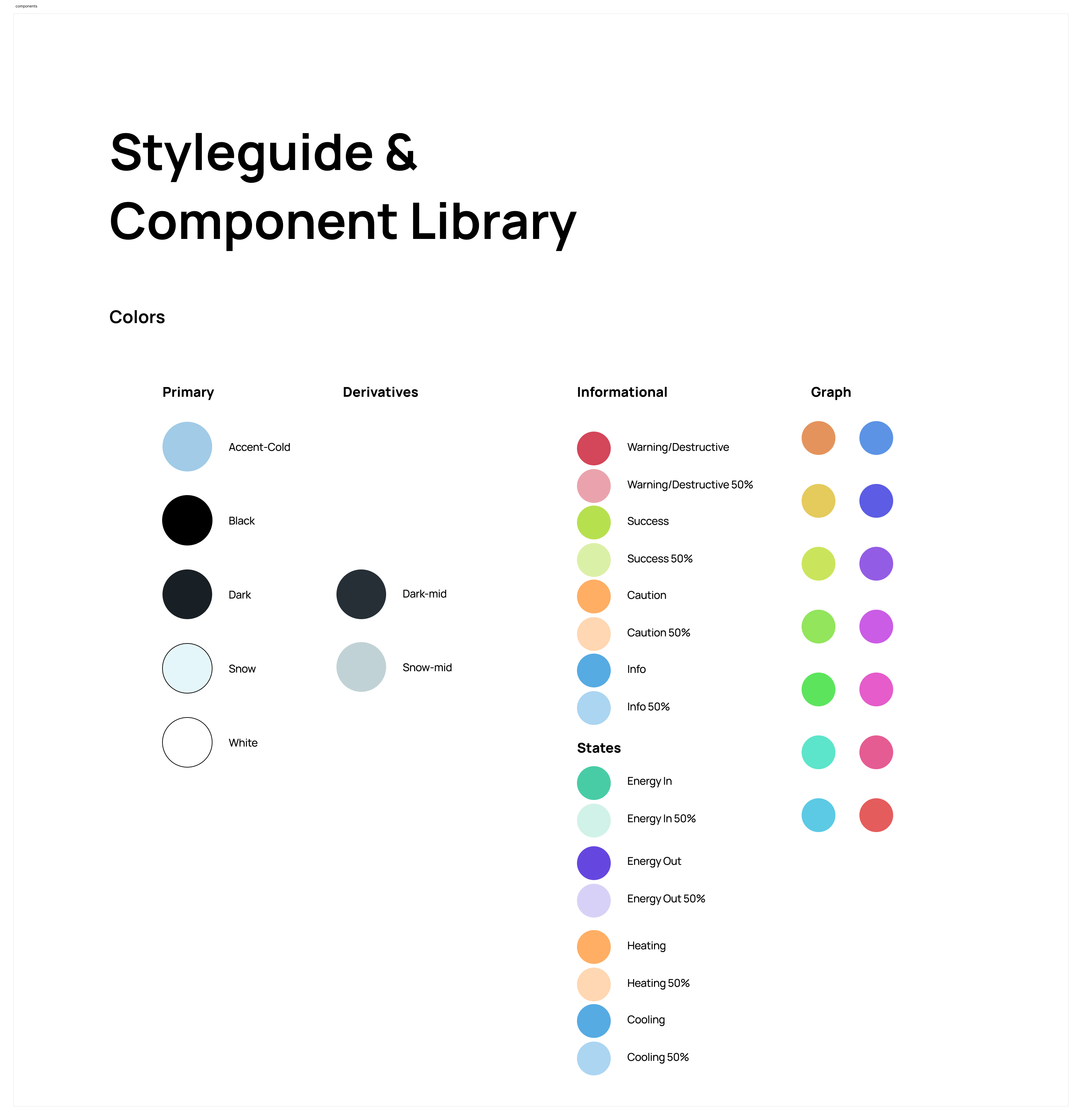
The visual identity I created for Weheat was grounded in the natural environment of the product. I chose dark and light blues to reflect the heat pump’s operation in both calm and dynamic settings. To break away from the often rigid layouts seen in engineering-driven branding, I introduced large diagonal sections throughout the design. This gave the brand a sense of movement and energy, ensuring it stood out in a market dominated by more static competitors.

adas

Translating to Print, Digital, and Product


Ensuring brand consistency across all touchpoints was crucial. From print materials to digital interfaces and product packaging, the Weheat brand became instantly recognizable. This cohesive approach unified the company's communication, making sure both installers and customers could connect with the brand no matter where they encountered it.
adas

Designing the Sparrow and Flint Heat Pumps

For the Sparrow and Flint heat pumps, the design had to balance between blending into its environment and standing out architecturally. Using EPP housing technology, I created a sleek, modern aesthetic that made these products not only functional but also an attractive addition to any home. This was essential for ensuring the heat pumps were not just utilitarian machines but elements that added to the home’s architectural integrity.

App and Portal

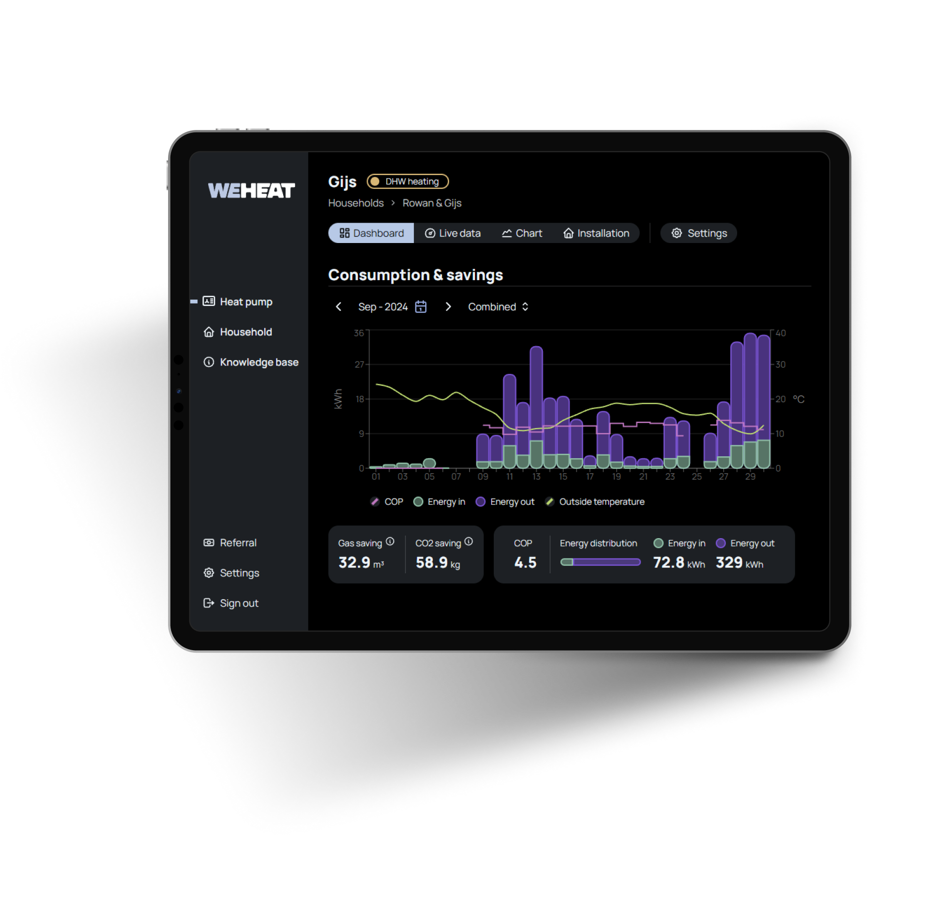
Beyond the visual identity, I also designed Weheat’s app and web portal. These platforms catered separately to the needs of installers and consumers, with custom dashboards tailored for each. For installers, the focus was on ease of setup and system monitoring, while for customers, the app provided an intuitive interface for controlling their home’s climate with just a few taps.

Results


Weheat grew from a startup to a multimillion-euro company, securing partnerships with companies like Coolblue and over 150 partner installers. One of the most frequently cited reasons for installers choosing Weheat products is the ease of use of its tools and apps. The human-centered design approach was key to making Weheat a success, both technically and commercially.
Looking for a wizkid?
Let’s create some sparks together!